When it comes to designing a small kitchen, you’ll encounter numerous “rules” that dictate where to place the oven and how to optimize functionality. While some of these rules are valuable and should be followed when feasible, others are outdated and unnecessary for every small kitchen.
We embrace the freedom to challenge design rules because it’s when you deviate from traditional approaches that more intriguing outcomes emerge. That’s why we consulted with kitchen designers to identify the outdated kitchen rules you can disregard when designing a small kitchen, as well as the unconventional rules you should actually embrace to maximize your space. This includes considerations such as color selection to create the illusion of a larger room, space-saving layout options, and strategic placement of storage solutions.
Outdated kitchen rules to ignore in a small kitchen
Throw out the rulebook and design a small kitchen that defies tradition.
1. The golden triangle is the only layout option
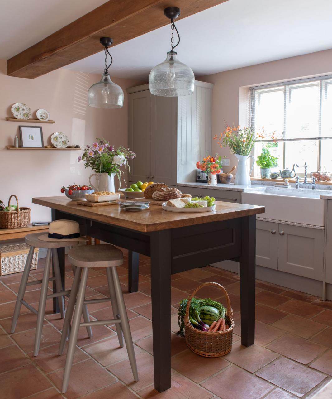
If you haven’t heard of the ‘golden triangle’, sometimes known as the ‘working triangle’, it’s a traditional kitchen layout that originates from the early nineteenth century, favored by housewives in order to make their time in the kitchen as efficient as possible. It’s based on the idea that the three main elements of the kitchen –the stove, sink, and fridge – should create an easy-to-move-around triangle within the layout of the kitchen. It’s still a go-to kitchen layout for reason – it works, it makes sense. But, it’s not the only option and sometimes in a small kitchen, it’s not even an option.
‘A dated rule that needs debunking is the holy fridge-sink-range triangle,’ says Leanne Kilroy, founder of Bird & Bone. ‘ Not only is this formation sometimes impossible in small spaces and awkward in larger ones, but it overemphasizes the importance of the fridge (which is used relatively infrequently) and underemphasizes the importance of other things, such as the placement of the dishwasher, bins, plates, and utensils).’
Designer Sharon Sherman agrees that, ‘the term work triangles for kitchens is outdated. Today’s kitchens large or small really work with zones, meaning, prep, clean up, and storage. Many times these zones do overlap. Believe it or not, one wall and galley kitchens can be the best designed kitchens. Smaller kitchens really need focused design to make them work.’
‘It is still a good idea to create zones for cooking, food prep, and washing up, so if you can’t make the golden triangle work, try and link two of the three areas as best you can. For example, it may be more convenient for you to have your stove and sink closer together, to ensure the washing up process is simpler and creates less mess, and the fridge can be positioned in a separate corner,’ adds Alex Main, founder of The Main Company.
2. Adding wall cupboards
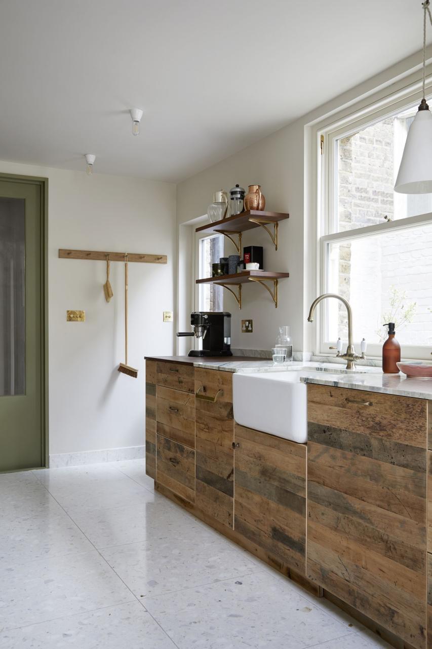
Not only is ditching the wall cupboards a huge interior design trend right now, but it can also be a better approach in a small kitchen than cramming the space with as must cabinetry as possible.
‘Instead, keep it open. Remove wall cupboards and opt for shelving if possible to give a feeling of space and light. A shelf is a nice alternative that allows space for decorative elements; leaning paintings, objects, etc. Or even incorporate an oversized mirror instead to maximize the feeling of space and light,’ suggests Ash McCullough, Lead Designer at Blakes London.
‘Open shelving in a kitchen can sometimes be seen as a dated kitchen style as it can look cluttered if not properly looked after and styled. In a small kitchen however, installing large upper cabinets can actually make the space feel smaller, so adding open shelving is a great way to store your everyday kitchen items but it also adds to the feeling of space and depth – as long as they are streamlined and not overcrowded.’ adds Alex Main.
Designer Lisa Sherry agrees, ‘ One common decorating misstep I see in small-size kitchens is the absence of open space. So-called negative space can be very positive! There’s a pressure to fill every square foot with cabinetry and accouterments in small kitchens. Open shelving, for example, provides just a bit of storage, but opens up a room.’
It can be tricky to know how to bring personality and character into a small kitchen because it feels like everything has to be so practical. But kitchen shelving allows for you to do both – you can bring in those more decorative pieces but also use the space to store crockery and glassware to get that balance of form and function.
3. The sink must be placed under a window

In a lot of more traditional kitchen layouts, you will find the sink is centered under a window. Of course, it’s lovely to have a vista above the sink, it’s nice to have the light too, and in terms of plumbing, it makes sense to have the sink positioned on an outside wall. But again, it’s not the only option and if you are tight on space it may not work with your design. In a galley kitchen, for example, having a window breaking up the banks of cabinetry is unlikely.
Instead, recreate that openness of having a window above the sink, and add shelving instead and opt for a light-reflecting backsplash that will make the space as bright as possible. ‘In small kitchens, having a sink under a window isn’t always functional for the best layout. By ensuring we had ample task lighting and display space a window was never missed in this space,’ explains designer Raina Henderson.
4. Backsplashes are a must
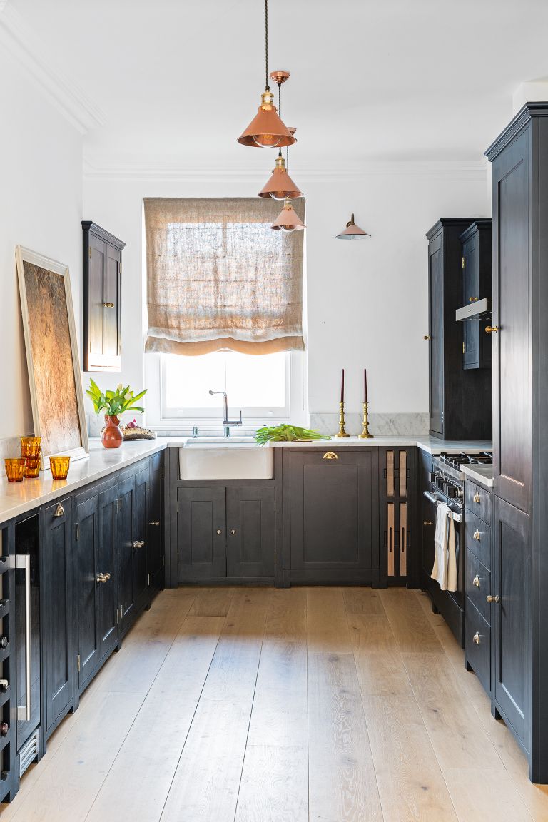
(Image credit: Kasia Fiszer)
‘Another dated rule is that you need a kitchen backsplash behind the sink and range. While stone, tile, or mirrored backsplash can be beautiful, they can so often be expensive afterthoughts that don’t fit well with the rest of the space and often in small spaces, simplicity is key. Eggshell paint is a wonderful, effective way to protect the wall from cooking stains and water damage without making a small kitchen even busier,’ suggests Leanne Kilroy.
Kitchens without backsplashes are a huge trend at the moment. It really leans into that kitchens that don’t look like kitchens, a style that everyone loves. And in a small kitchen, this look can work as you don’t have the busyness of grout lines and by using a really robust paint the room can feel bigger and more open. Add an upstand to make the meeting between the worktop and the wall more seamless and to give the lower (and most likely to get messy) section of the wall protection.
5. Lighter colors work best in a small kitchen
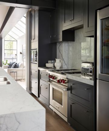
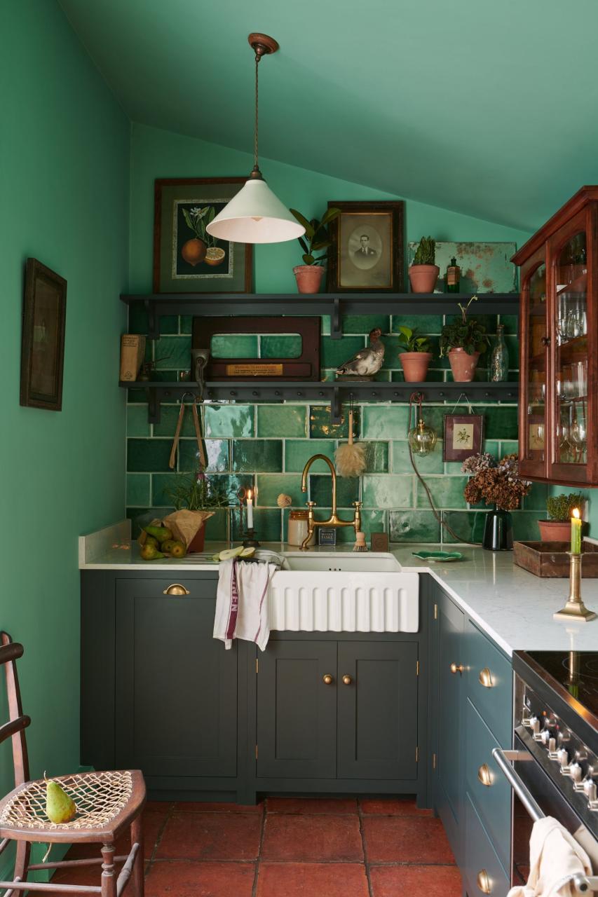
It’s design 101 that lighter colors work best in smaller spaces right? Well yes, paler shades can work to ‘expand’ a space, but that’s not to say darker or bolder colors so therefore be avoided altogether. Darker shades can also help a space feel larger as they can blur the room’s dimensions and trick the eye – case in point this dark kitchen.
‘It used to be the wisdom that you should use very subtle, light colors for a small kitchen, but you can use any color you like if the design is smart and the materials and finishes are right, for example, you might have a very discreet sheen or luster to the materials that are used that reflects back the light. So go bold or darker if that’s what you want!’ Jane Stewart of Mowlem & Co.
Simon Temprell, Interior Design Manager at Neptune adds, ‘A small kitchen does not have to be all-white to compensate for the lack of space. Color can be used successfully to elevate the design or to distract the eye from problematic areas. And don’t paint the ceiling white as it will put a visual ‘lid’ on the space. Continue your wall color across the ceiling to blur the sight lines between wall and ceiling.’
6. Designing a larger kitchen on a smaller scale
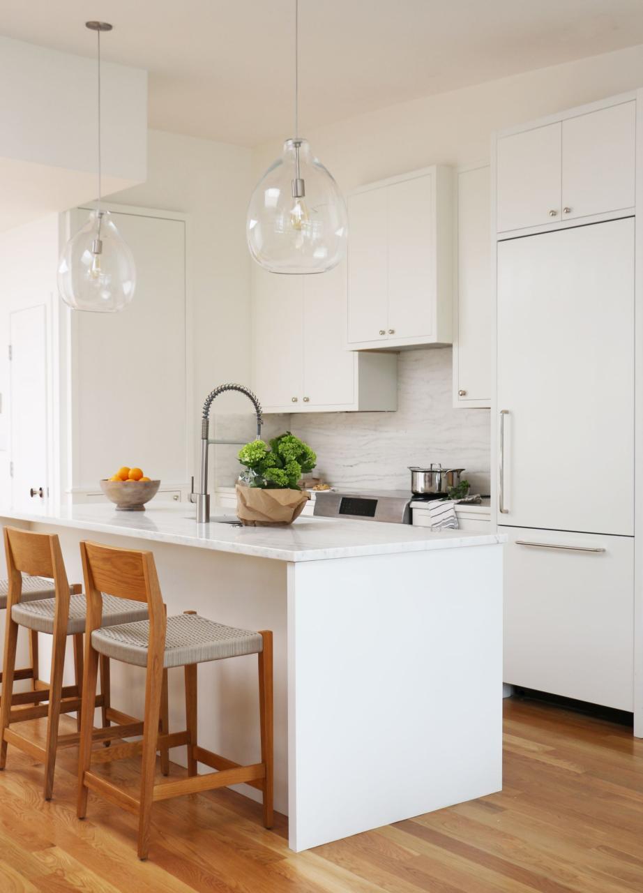
(Image credit: Victoria Holly)
An outdated rule you can ignore when designing a small kitchen is thinking you must cram in all the essentials. When space is tight you have to take a different approach than just packing everything in on a smaller scale, you can’t just take a larger kitchen design and make it smaller. Think about how you use the space and what your essentials are, and get clever with the design too, think about where to can fit in extra storage or where you can save space with appliances – do you need them all? Do they come in smaller sizes?
‘So many older kitchen designs didn’t strategically think through what’s essential in a kitchen and how to apply that to a smaller size kitchen. Instead, these kitchens just tried to cram everything in a normal kitchen without regard to layout and functionality,’ explains Victoria Holly, Principal, and Founder of Victoria Holly Interiors.
‘We designed a lot of smaller-scale kitchens in New York City, and we would incorporate things like smaller-scale 18″ dishwashers, fridges, and freezer drawers, bringing cabinetry all the way to the ceiling, and utilizing hidden, shallow storage on the other side of the island. We also made sure that we were more cohesive about our design choices.’
7. Islands need to be huge to be useful
(Image credit: Jody Stewart)
While we would never recommend adding an island if you really don’t have the room, it’s not impossible to fit an island into a small kitchen. Especially if you redefine what an island is (butcher’s blocks and trolleys can be great small kitchen island alternatives), they can work on a smaller scale and don’t need to be huge to add extra storage and surface space.
‘There’s no reason why you can’t have an island unit in a small kitchen especially if it’s part of an open plan area,’ explains Jane Stewart. ‘With bespoke designs, you can achieve something that is multifunctional, multilevel, and perhaps with curves to help the flow of space. The key thing is to have everything in appropriate proportion to the architecture of the space, and to make the absolute most of that space without it feeling cluttered.’
8. You need an island for a kitchen to be functional
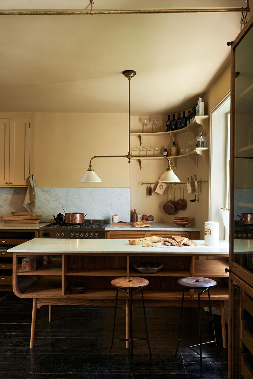
(Image credit: deVOL)
However, you do not need an island in every kitchen. If space or shape doesn’t allow for an island that’s big enough to be useful or doesn’t allow for enough space to maneuver around it, then don’t try and squeeze one in. An island should ideally have clearance of at least 40″ around it, and don’t bother adding an island smaller than 30″ x 39″.
‘It is often thought that a kitchen island is an essential feature to incorporate into a design, however, it is recommended to try not to squeeze in an island if the room does not lend itself to this layout. There are other solutions that are better suited to a small space such as peninsulas. They create additional work surface space, storage, and seating and can also be a great option if you want to avoid corner units,’ suggests Elizabeth Sherwin, creative director, of Naked Kitchens.
9. Galley kitchens don’t always work
(Image credit: deVOL)
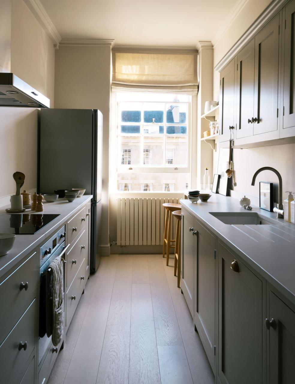
Galley kitchens get a bit of a bad rap, seen as dark, awkward, and narrow – a final resort choice for a layout. But the galley kitchen has been in existence for centuries for a reason – they are an incredibly practical use of space. Having countertops on either side is an ergonomic dream, and allows for as much storage and surface space as your small square footage can hope for.
‘Galley kitchens have often been given a name for themselves as being dated and cramped due to their narrow layouts and parallel counters. However, for maximum efficiency when short on space, a galley kitchen is ideal as it allows for plenty of storage,’ says Elizabeth Sherwin,
The key to designing a galley kitchen that feels light and open and well… less galley-like is not to fill it with too much cabinetry. Stick with just one wall of cabinetry, or if you can afford to forgo the storage, just ditch them all together.
10. Shelves cannot be placed in front of windows
(Image credit: Cindy Apple Photography)
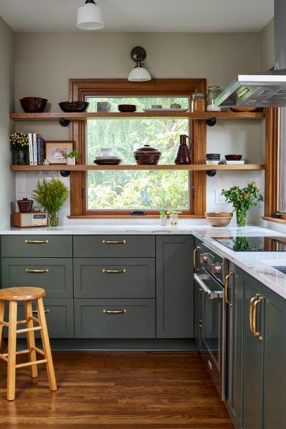
Putting cupboards around a window in a small kitchen will always sap light, so you want to keep that space open and block as little light as possible. However, that doesn’t mean you can’t put the space around, and even in front of, the window to use. This is such an innovative, unusual idea from Raine Henderson, the shelving is slimline and straightforward enough not to prevent light from flowing into the room, but it still makes use of the wall space.
‘Installing open shelves in front of a window is a faux pas is a dated kitchen rule. In this small L-shaped kitchen, adding natural light and storage was vital. We opted for open shelves for everyday crockery making essential vertical storage space,’ says designer Raina Henderson.
11. You need to include an extractor fan
(Image credit: Future/Paul Raeside)
‘One dated rule I think really needs to be retired is that you need an overhead extractor fan above your hob. Not only can overhead extractors be really unsightly, but they take up precious space in a small kitchen that could be used for open shelving or uppers,’ suggests Leanne Kilroy.
‘It’s little-known that adequate extraction can be achieved with a bathroom-style extractor tucked away on any external wall in the room and, as long as a shelf or upper is 70cm away from the range, it will be well out of the way of splashes and steam.’
