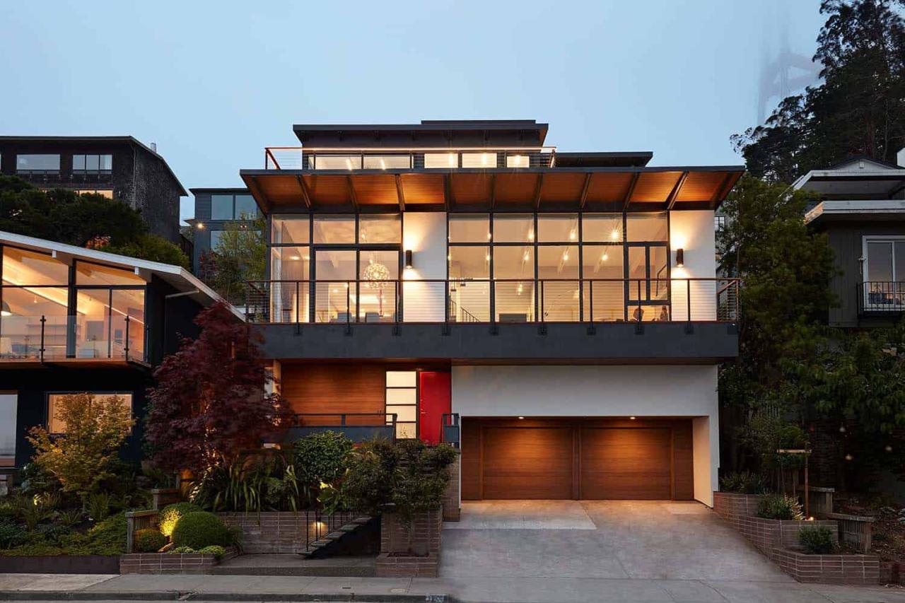
When the previous homeowners of a charming midcentury modern house in San Francisco enlisted Klopf Architecture to remodel the interior and make minor exterior updates, they could never have anticipated how their project would pave the way for an extraordinary transformation.
The new homeowners, a young family of four, had a vision for the house that went beyond its original character, blending modern, minimal design with the existing mid-century aesthetic. To bring their vision to life, the new homeowners enlisted the expertise of Klopf Architecture who specializes in both modern and mid-century modern design and brought back general contractors San Francisco Design and Construction to build the Klopf team’s vision.
DESIGN DETAILS: ARCHITECT Klopf Architecture Project Team: John Klopf, AIA, Geoffrey Campen, Yegvenia Torres-Zavala and Mason St. Peter CONTRACTOR San Francisco Design and Construction
The key challenge was to create an addition that would integrate with the original structure and butterfly roof shape while maximizing the home’s potential, including taking full advantage of its breathtaking views of San Francisco and the Bay.
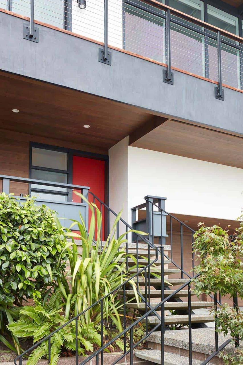
The exterior received a complete refresh, with a mix of new materials, upgraded hardscaping, and a modern color palette. What was once a one-material exterior became a dynamic interplay of textures and forms, striking a balance between the home’s mid-century roots and contemporary design sensibilities.
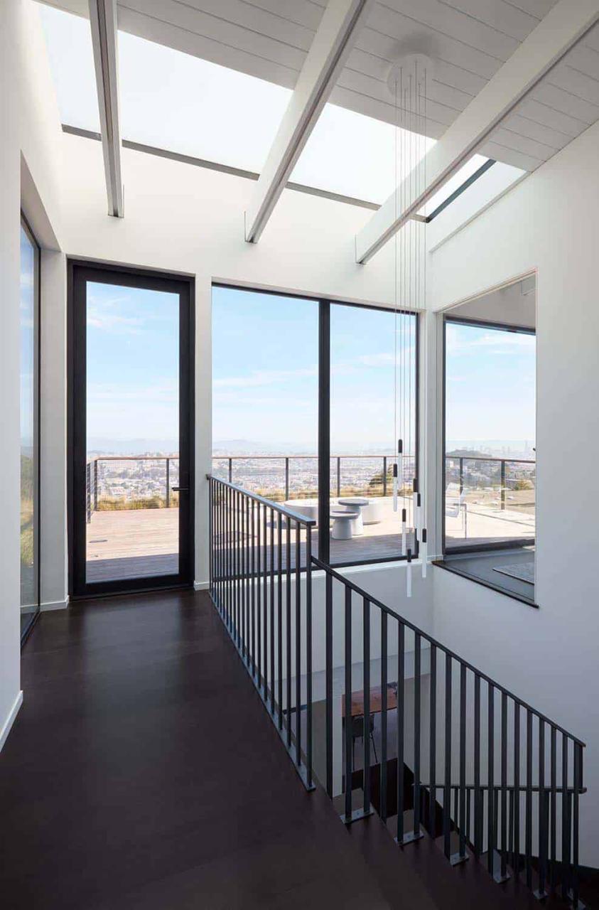
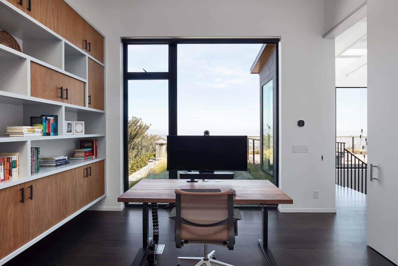
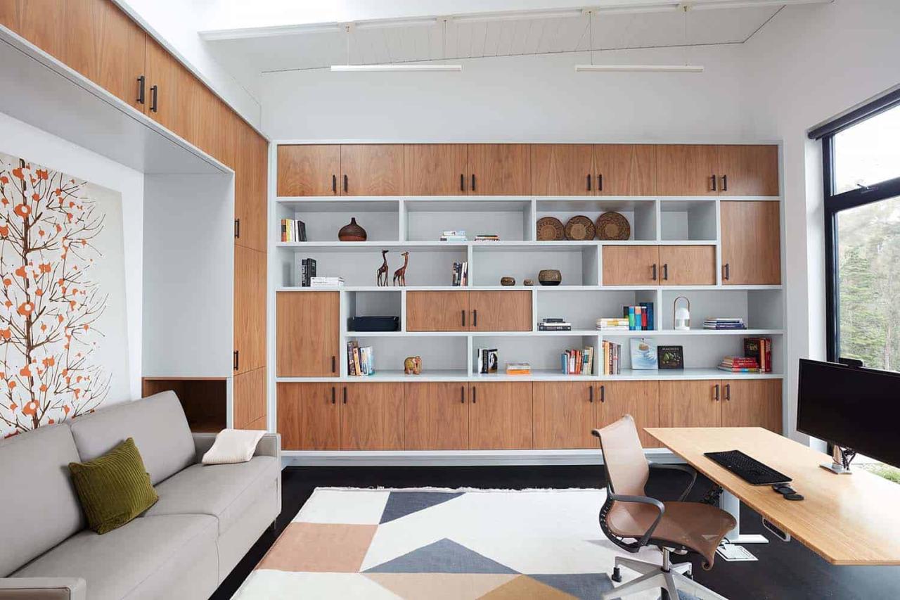
The ambitious project involved constructing an entirely new upper floor, featuring a primary suite, office, and an expansive roof deck. The roof deck added a significant amount of living space where there was none before, providing much-needed outdoor space in the absence of a backyard, and further enhancing the connection to the outside and the view.
To further texturize the home’s exterior, a green roof was installed outside the office, creating a sense of calm and blending the addition with the surrounding treetop landscape. This innovative outdoor space rests high above the street and provides a serene retreat for the entire family and their guests.
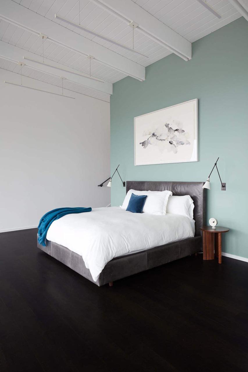
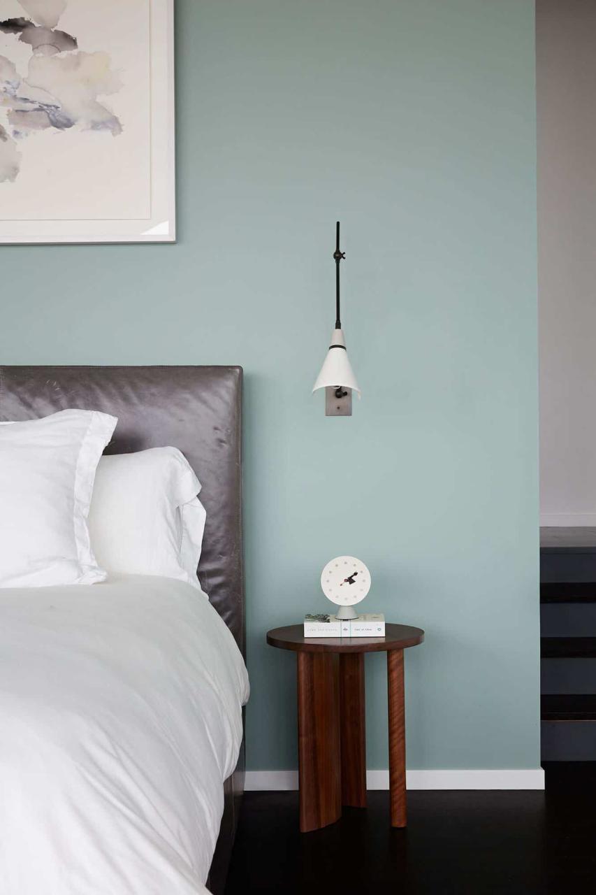
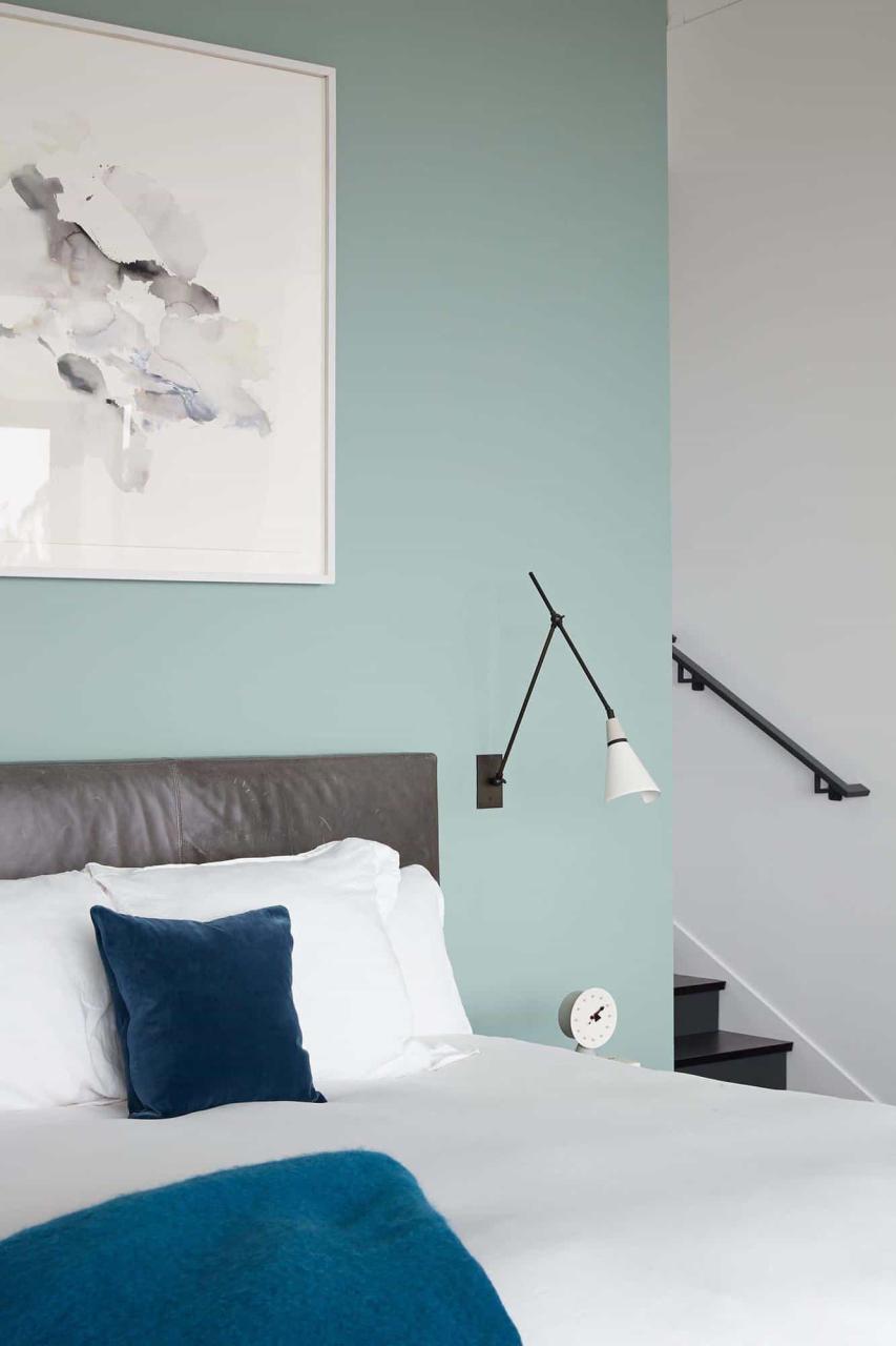
The addition serves as a private sanctuary for the parents, offering a much-needed escape from the bustling energy of the lower floors, where the children spend most of their time. The upper level houses the client’s office, a viewing and sitting area within the primary suite, his and her closets, and a vast private roof deck overlooking the cityscape.
In a masterful design move, the architects connected the new upper level to the existing butterfly roof, forming a unique “taco shell” geometry that encapsulates the new structure.
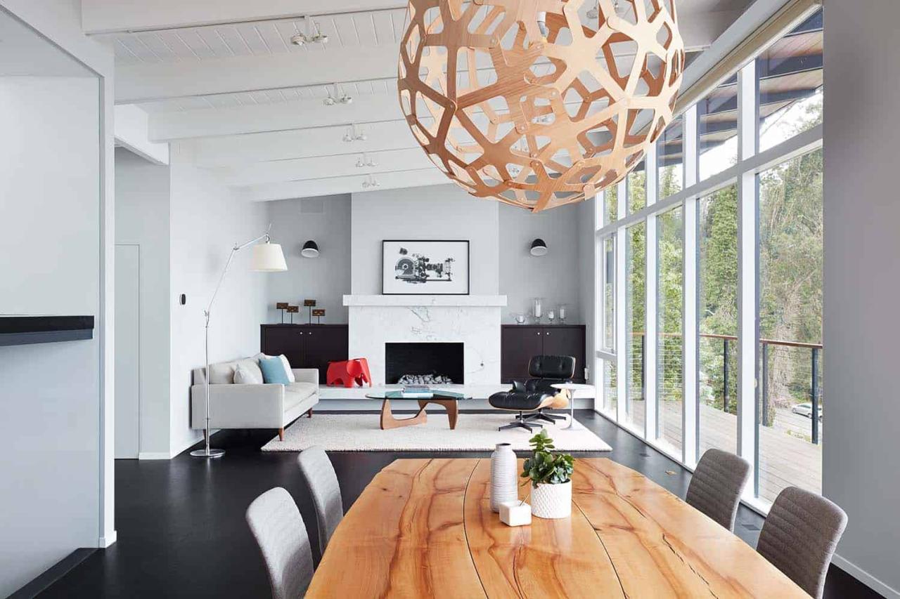
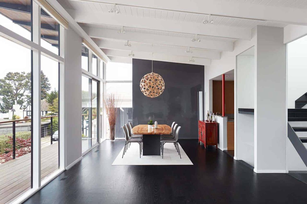
The house’s north-facing orientation allowed the architects to embrace openness and light without concerns about heat gain or extreme sunlight. Some key features from the main house, such as the tongue-and-groove ceilings, exposed beams, and flooring, were incorporated into the addition to create a cohesive, harmonious design.
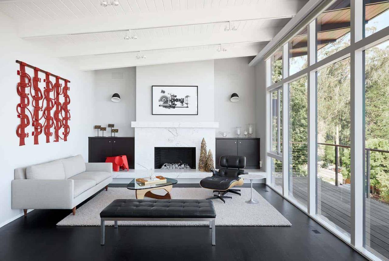
The result is a stunning architectural gem that celebrates the best of San Francisco living, boasting unparalleled views and a seamless blend of mid-century modern charm and contemporary design. The architects’ vision of a modern sanctuary above the city has been thoughtfully realized, redefining what it means to be a mid-century modern home in the 21st century.
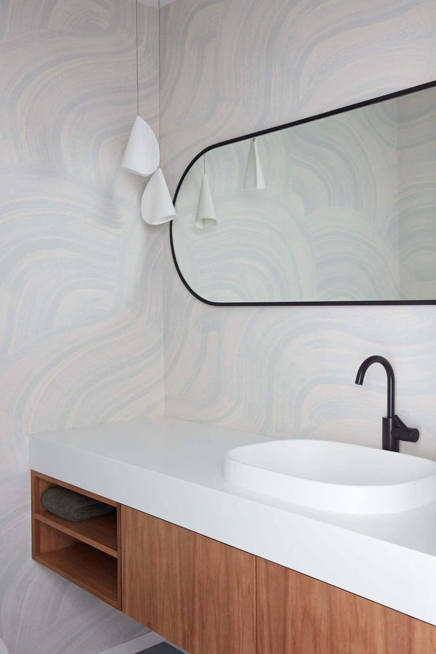
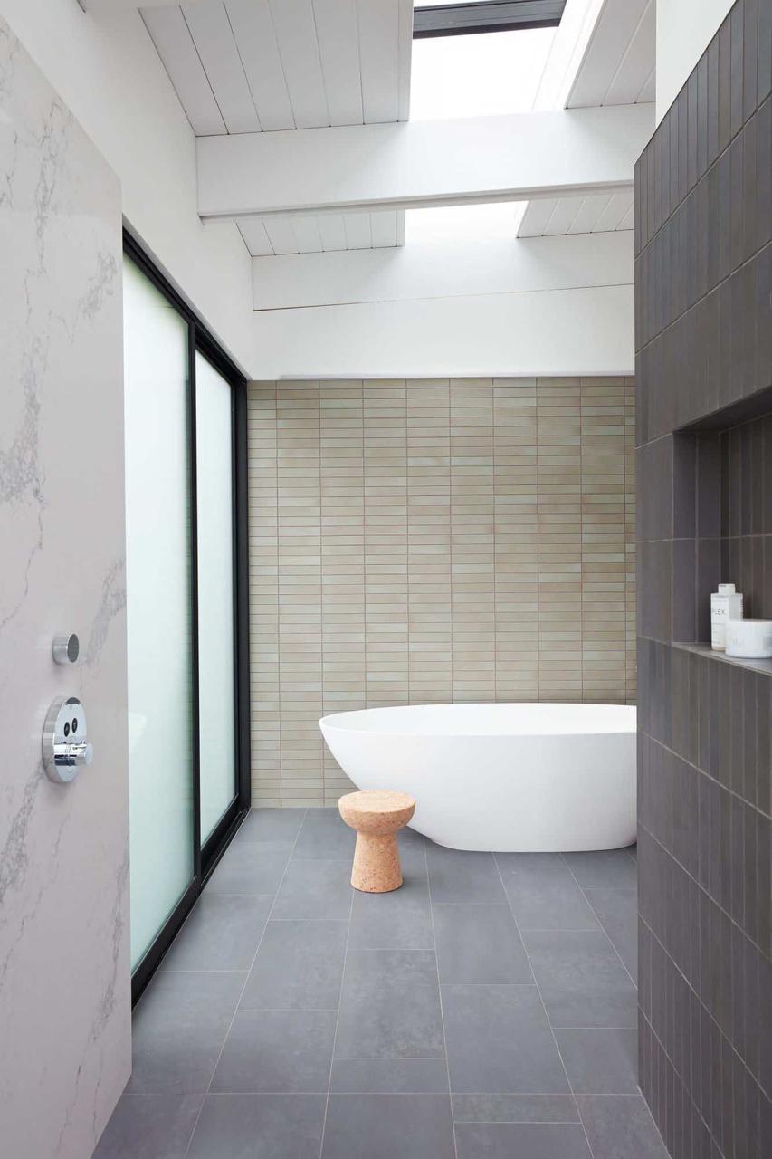
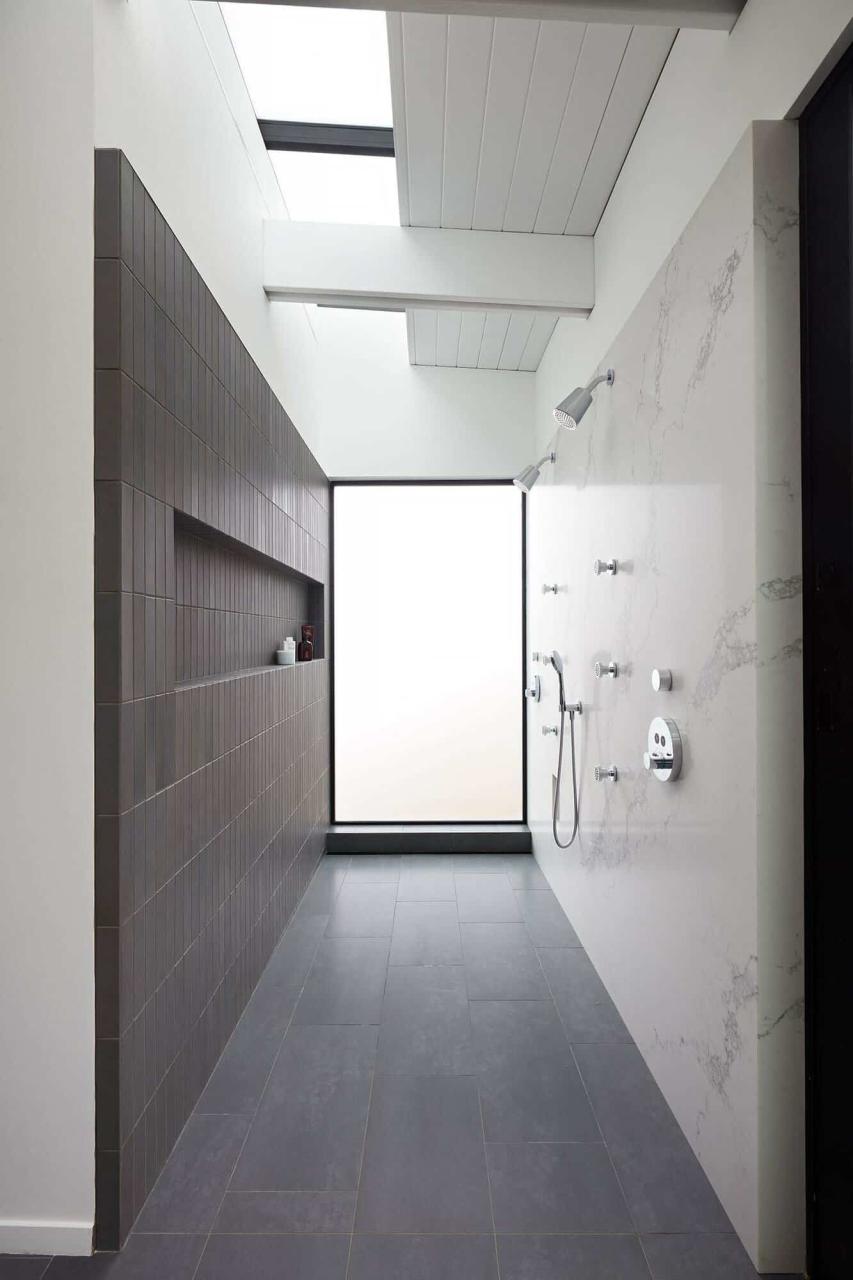
What We Love: This midcentury modern house in San Francisco provides a newly refreshed design that will be enjoyed for years to come. Living spaces capture views of the San Francisco skyline, while bathrooms are cleverly devised to provide privacy while still bringing in natural light through skylights and translucent glazing. Living spaces are more connected and an expanded deck provides more usable outdoor living space that soaks in the views.
Tell Us: What are your overall thoughts about this midcentury modern renovation project? Let us know in the Comments below!
Note: Be sure to check out a couple of our favorite home tours that we have featured here on One Kindesign from the portfolio of the architects of this project, Klopf Architecture: Indoor/outdoor connectivity defining mid-century modern Los Altos home and Fresh modern update to an Eichler house in the San Francisco Bay Area.
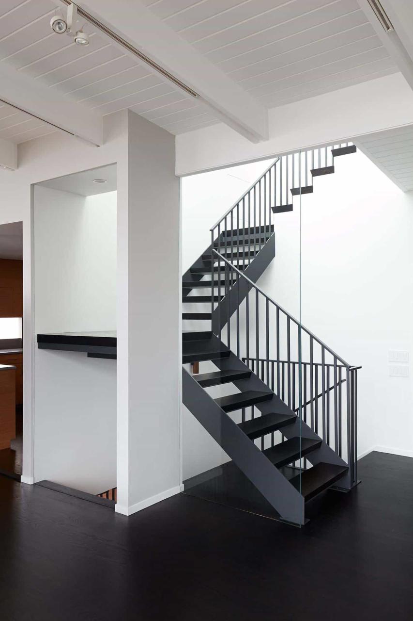
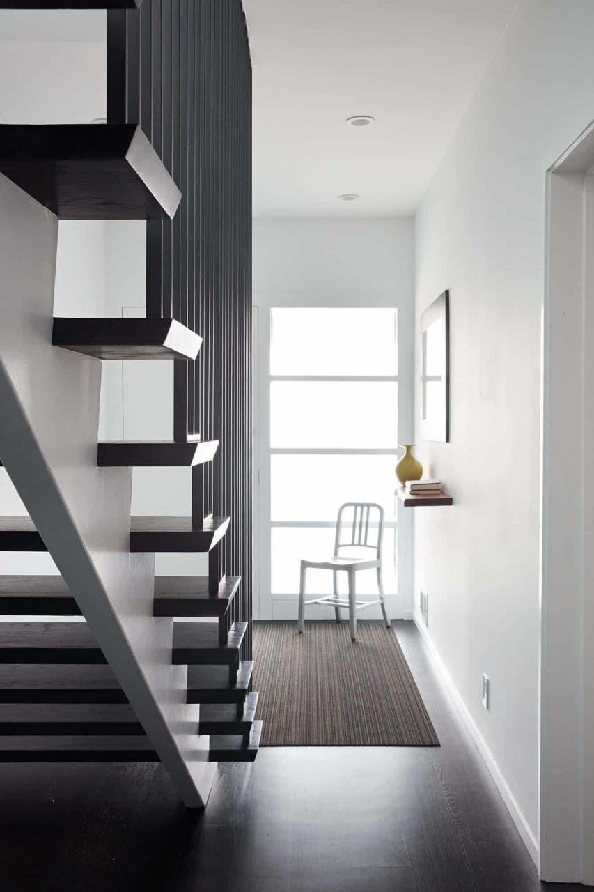
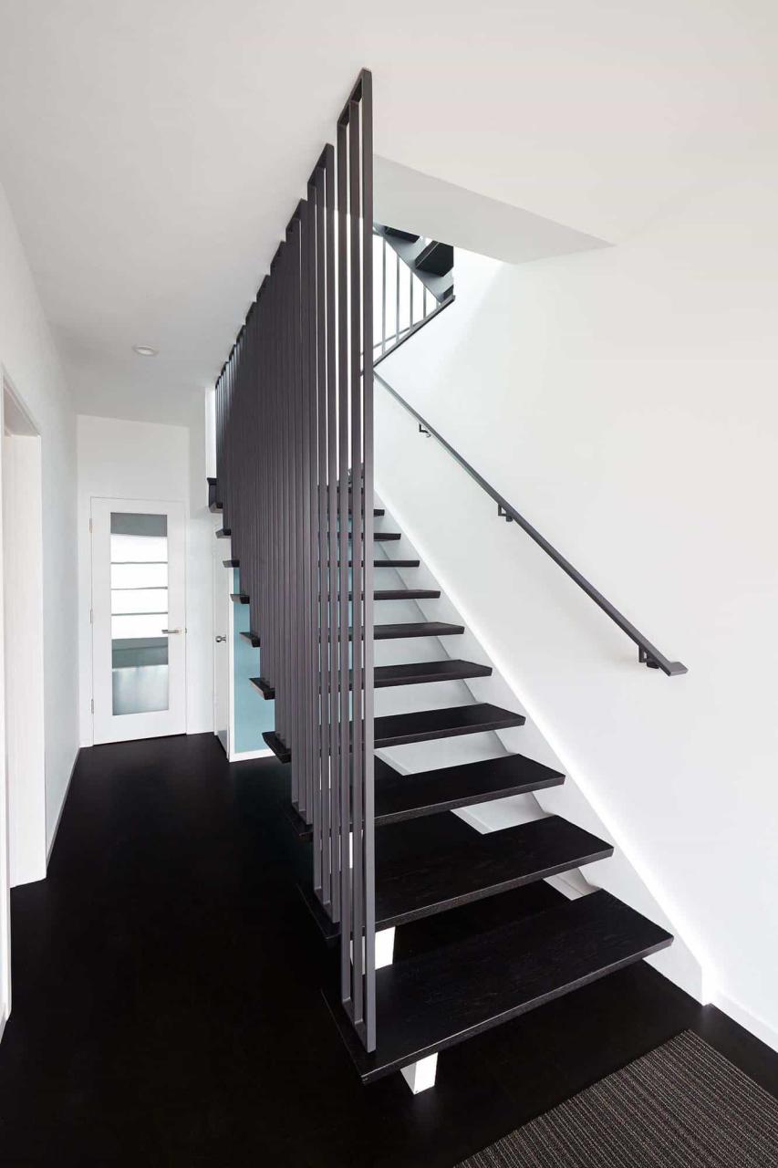
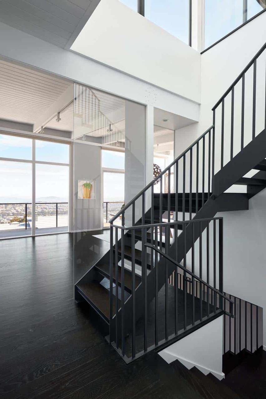
On the main floor, the only updates were the stairwell and lightwell, which now flood all three levels with natural light. The custom steel stairs with open wood treads give the staircase an airy, contemporary feel. By shifting the staircase forward, the architects cleverly prevented guests from needing to pass through the primary bedroom to access the roof deck.
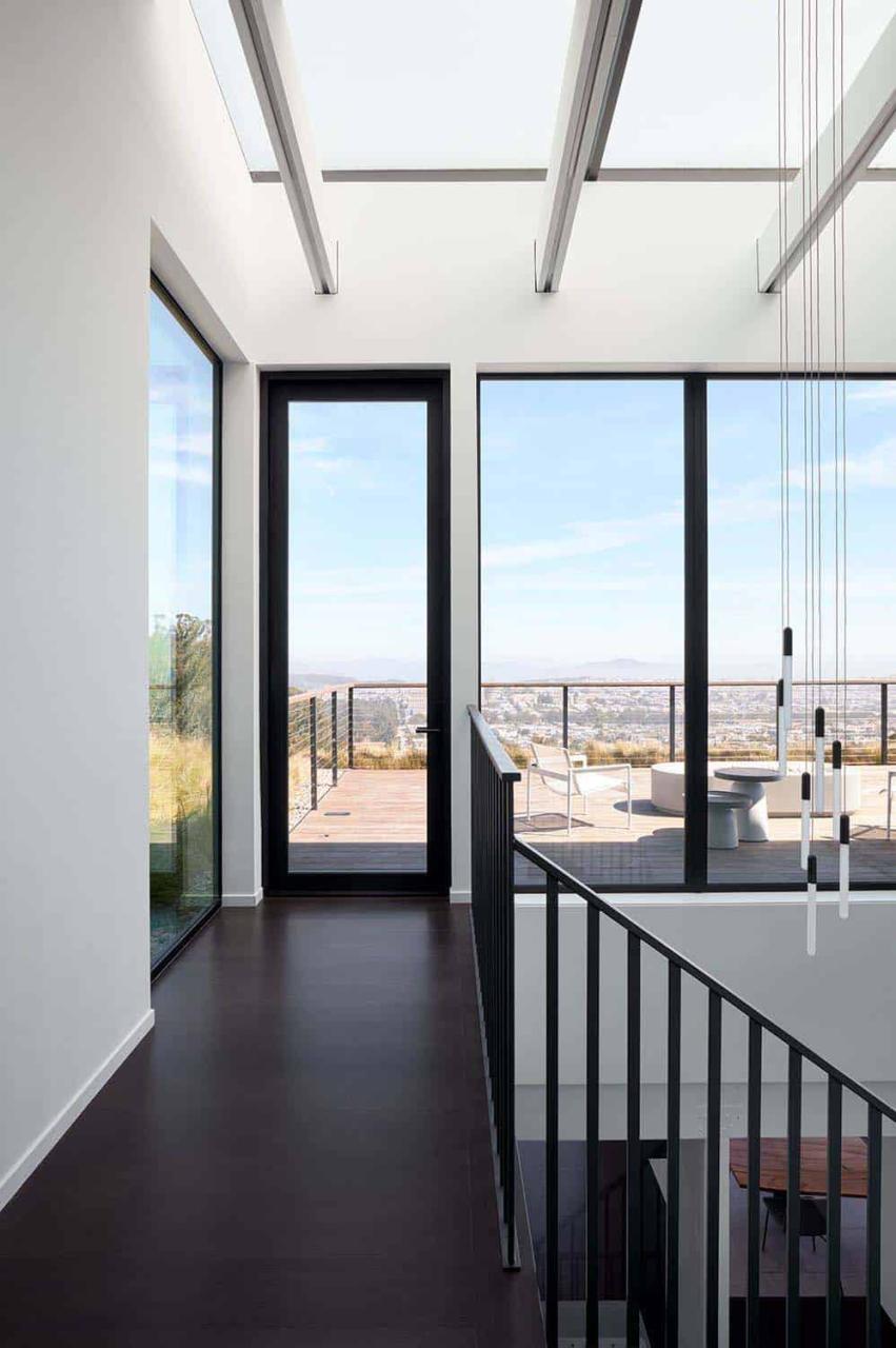
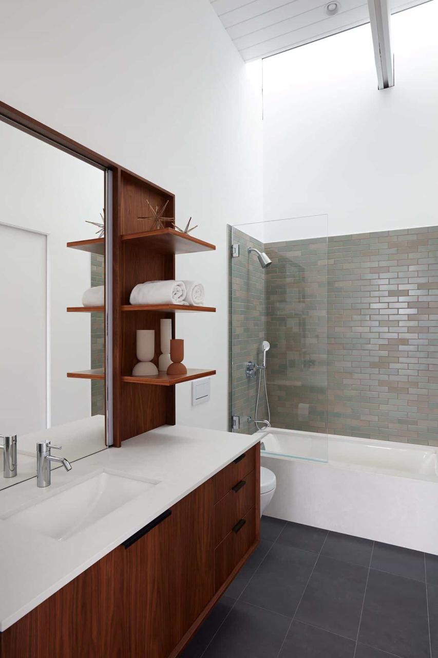
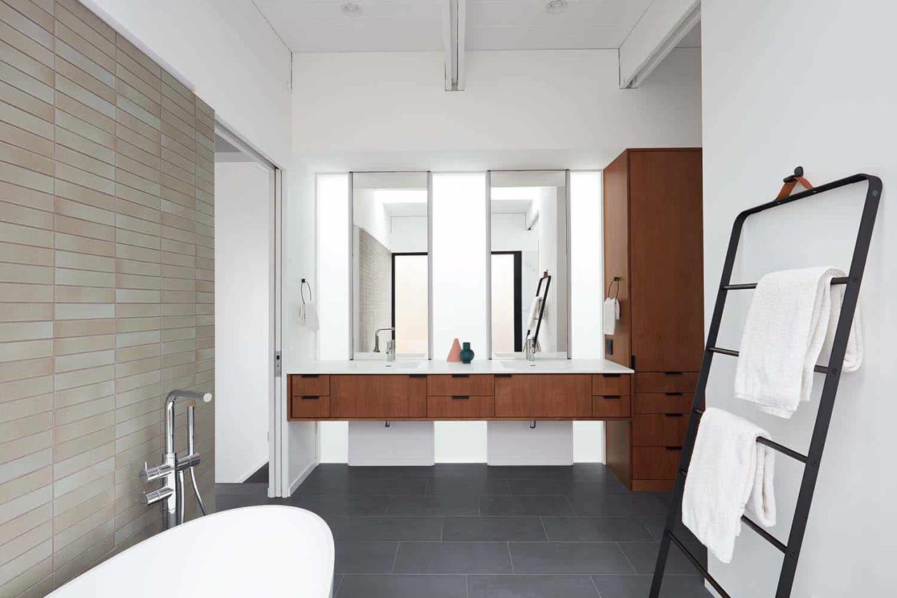
The primary bathroom is a study in serenity and light. A wall-sized lightwell behind the vanity wall illuminates not only the bathroom but also the family room below, compensating for the loss of skylights when the new level was added.
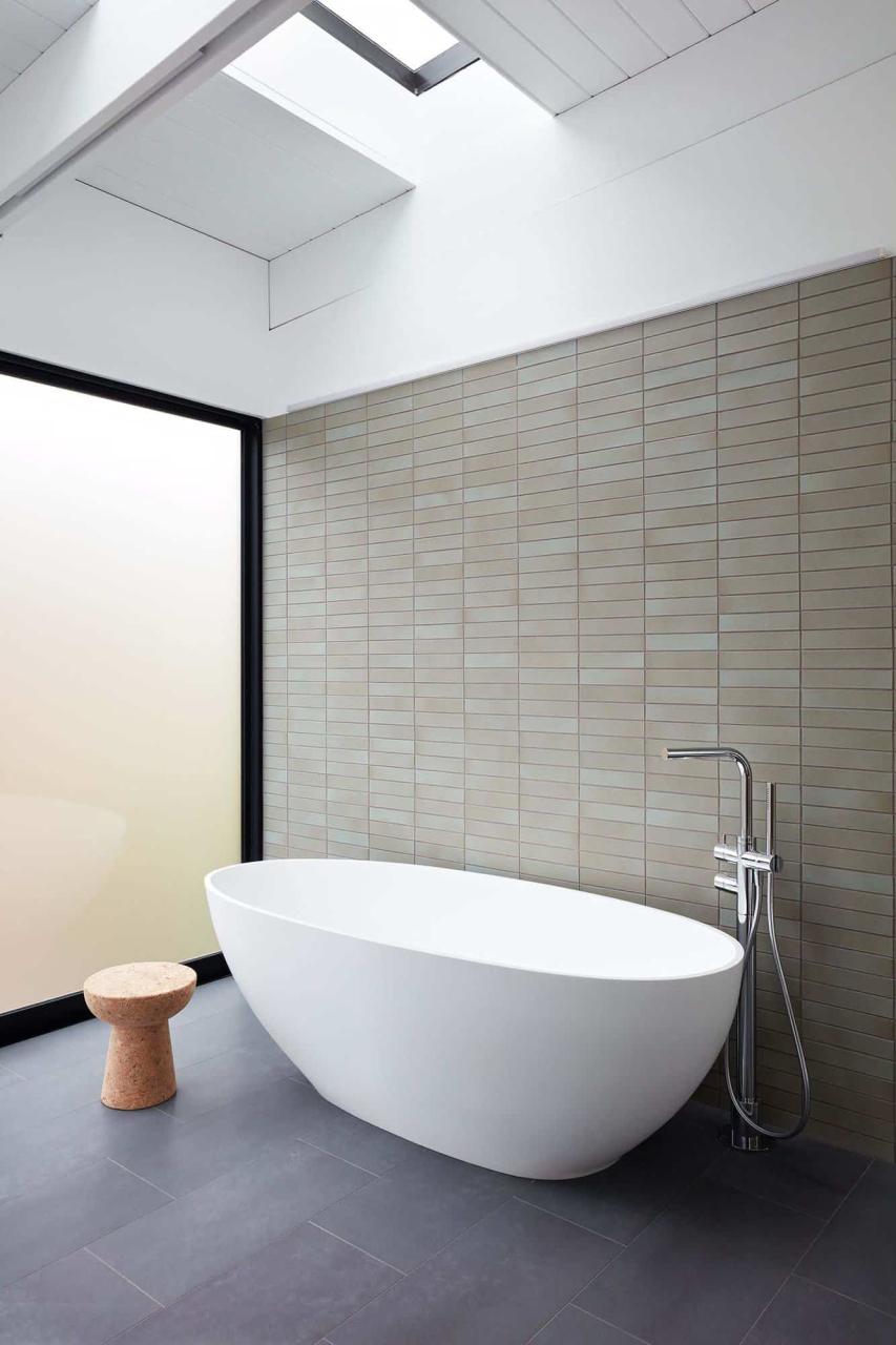
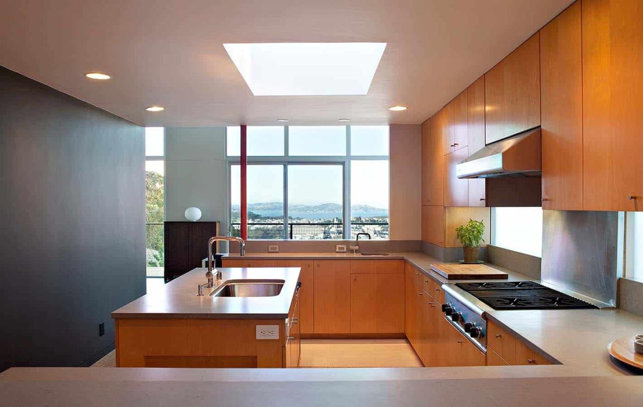
Skylights strategically placed windows, and ample lightwells create an airy, sunlit atmosphere while ensuring privacy.
